WOAH! I just reloaded my default home page and there is now a yellow message saying “Netvibes goes mobile! Now, you can check your Netvibes page on your mobile phone or your iPhone at the following address: http://m.netvibes.com” and of course I had to see how they implemented it. Well, the quick answer is, AMAZINGLY WELL! [Updated: they now have a post on their internal blog.]
This was one of the first sites that I tested out when I first got my iPhone. It is my spring board to all news feeds that I’m interested in. It rendered fine when I viewed it as a regular old web page but it was a bit cumbersome to navigate and read through all of my feeds. Obviously this was something that the Netvibes Development team would be working on and they have, once again, pushed out a release that is outstanding. But, I believe that this release will not only make iPhone users happy (due to all of the nice AJAX and “rounded corners”) but also the regular mobile users.
UPDATE 08.31.07: It looks like if you go to the “m.netvibes.com” address via an iPhone, you get the iPhone interface automatically. If you go from a regular phone, you get the more WAP-py version. If you want to see what the iPhone interface looks like, point your browser to: http://iphone.netvibes.com.
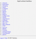
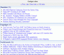
I have taken a few screenshots of what I would expect a standard phone user to see (just a shrunken down Firefox window for now).
Main Screen
Tab View
Feed View
So, those definitely look very WAP-py and all text but they work fine.
For the iPhone though, it looks like a true, iPhone-enabled and designed application. It has big fonts, a clean and clear interface and very easy navigation. Well, pictures speak a thousand words so I now will dive right into pictures.
Login
Main Screen
Tab View
Feed View
Very nice, no?
HTD says: Great job NetVibes! Once again an impressive update!


