Microsoft has been including IE7 in all of the latest Critical Updates. It’s getting harder and harder to avoid installing. At my work, we recently had to roll back some of our users’ machines to remove IE7 so that an automated testing software could run properly on IE6. So that got me thinking (and searching) and I found this great installer that lets you install earlier versions of IE (without really messing up your system). It installed fine and seems to work pretty well (had a couple of crashes on some of the versions, but not a big deal).
I then started thinking some more…what would a lot of the sites that we use today (Web 2.0 sites, sites with lots of CSS or DHTML, DIVs, etc.) look like on those earlier versions. So just for fun, I decided to take screenshots of my blog with each browser. Below are the results. It’s a pretty fun (and funny) evolution. (Also, I love how the theme that I use still works in terms of push the “use Firefox” message!). For the release information, I found this useful Wikipedia source.
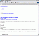
IE 3.0 – Released in August 1996
Comments: Wow, look ma, no color or images or text formatting
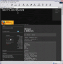
IE 4.01 – Released in November 1997
Comments: Ok, now we have a black background and some layout structure, but barely!
IE 5.01 – Released in November 1999
Comments: Now this is getting closer to what we expect but layouts are still not correct, things are overlapping and not lining up, some elements are missing.
IE 5.55 – Released in July 2000
Comments: Hard to tell that much of a difference between this one and IE 5.01 but layouts seem to be better. Still missing some things though…
IE 6.0 – Released on August 27, 2001
Comments: Again, not much difference from the previous version…navigation element is still missing next to the title (see IE7.0 for how it “should” look).
IE 7.0 – Released on October 18, 2006
Comments: Here we are, current version of IE. Now the elements seem to line up properly. That missing navigation is present and life is good!
I think it would be fun to try this on some “true” Web2.0 sites…the results might be truly laughable. I did try IE3.0 on MSN…wow, what a difference 10 years makes (grin).


