Recently, I have had a couple of interesting conversations with some friends who are either interested in redesigning their website or have clients who are doing the same. And, with the trend of flashy and feature-rich WordPress themes popping up left and right, it seems that many people are getting distracted by these “bright and shiny” options to help revitalize their websites or create a new, rich experience online. But, in my opinion, these themes can be distractions on what should be the core focus on any site, the content. So which should come first? The content or design?
Some of the “hot” new design trends are capturing attention. For example, it is quite easy to get caught up in the “responsive” design of new themes. Actually, it’s quite a good feature to have if you are thinking about reworking your website. Responsive means that your site will scale, hopefully elegantly, to different sized screens and devices. Google search algorithms now look closely at if a site is “mobile friendly” or not and responsive design helps with that check-box. But then come things like parallax, where an image seems to magically stick in the background of a page while the content on top of it scrolls by. It’s fancy, it’s glitzy, it’s eye-catching. And some of the newer themes available for purchase have gobs of elaborate interactive designs, well worth the price of the themes.
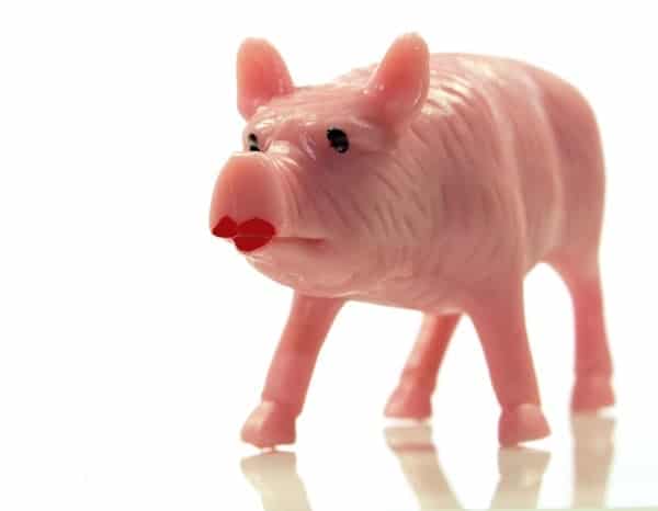
But as I said, it is easy to get caught up in the design hype. But if you don’t have the content to back it up, your design is meaningless. It’s like putting lipstick on a pig.
It’s All About the Content
I recently redesigned HighTechDad.com with one of these flashy new themes. I was lucky though, I had the content already. I just needed to present it a bit better to increase readability while using some of the newer design tactics present on other similar sites.
If you are creating a new site from scratch, my recommendation is to focus on the content there first and then wrapping an aesthetically pleasing display around it later. But more about that later. When you think about it, users of the Internet are looking to consume content, whether it is written or graphical (e.g., images or movies). While Google’s complex search algorithms do take things like load time (e.g., don’t have really weighty images) into account, users typically search for words (or images). And Google indexes these words or phrases and presents results. The eye-candy is stripped away and what remains when the spiders crawl a site is the content.

Another way to think about it is when you write a book. You wouldn’t design the book cover before having the book (or most of it) written. That’s like putting the horse behind the carriage. In the same way, you wouldn’t put up a website with nothing in it. Sure, you could fill titles and text with Loren Ipsum (greek text) to see what something might look like before content is available. But typically, at a minimum, the structure of the content has already been defined, that is to say, the sections and subsections.
In many cases, the type of content you create determines the design. If you are a photographer, for example, you need a compelling way to present your art. But without having or knowing what that art is, choosing a design makes no sense. If you take nature photography, for example, you probably don’t want to choose an industrial-looking design (unless you are trying to show the contradiction as a statement as well). Similarly, you wouldn’t choose a design that obscures your art, you would want some sort of design that has a portfolio components.
It’s easy to drift away from the content. Resist the urge if you can.
Design Makes the Content Zing
Design dresses up your content. But it also creates your brand, whether it is personal or corporate. For example, I try to stick with a particular color palette and have with all of my various iterations of my site. I have used various free and paid themes and every few years or so, I have re-wrapped my content. But the focus on my redesigns has (hopefully) remained on the content.
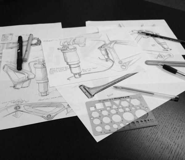
Remember though, design can get expensive quickly, especially if you are employing a third party to do the work. I have been through enough corporate (and personal) redesigns to know how time and money can add up quickly. As with any type of development projects, one of the most critical phases that should be done early on is requirements gathering. If done properly, this – sometimes painful – process initially, can save you time and money later on. It helps to not only define the scope, but also understand the focus and core needs as well as the nice-to-have’s.
Whether you are starting from scratch or reworking what you have, you need to construct the house first and paint it later.
How to Approach a Site Redesign
There are many different methodologies to designing or redesigning a site. Books have been written about this and there are sites devoted to this subject.
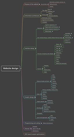
- Focus on content first (if you didn’t get this by now, you haven’t been paying attention)
- Create sections for your content as this will help determine the design
- Look at other sites you like (or don’t like) for design or presentation ideas
- Before choosing a design, talk to friends or colleagues about the structure of your content to be sure it actually CAN be presented in a compelling way
- Draw a map of your site so that you or your designer understands how it logically works
- Rework your content to make it tight & succinct (ha – I tend to write a lot so this is hard for me)
- Once you identify a design (or theme), choose the functions that showcase your content in the best way without overwhelming the content itself
- When possible, use a development site to do the majority of the work, then publish and fine-tune once it is live
- Go back and re-read your content and edit appropriately
Don’t get me wrong. Both content AND design are critical and extremely important to your brand and your audience. It’s a symbiotic relationship. You may choose that for you or your audience, having no design or an extremely minimalist design is what is important so that the focus is purely on your content. Conversely, if you are a graphic design shop, part of your content is creating extremely compelling designs for your clients. In this case, you need to carefully balance your own site’s design with clearly presenting your portfolio of designs (your content).
Still, I return back to the content as the critical piece to any site launch or redesign. I guess, in this case it is the egg that hatches into something unique. By understanding what your compelling content is and what your audience is consuming, you should be able to better articulate what the design that wraps it all up should be. Don’t get stuck on making it look like everything else otherwise you blend into the background. You can, however, use newer design options to better showcase your content and make it stand out, without detracting the focus from the content itself.
HTD says: How do you go about a site design or redesign? What comes first for you, the content or design? Leave a comment!

