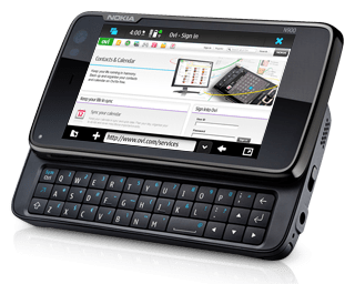
For the past several weeks, I have been doing some on and off testing of the Nokia N900, a smart phone running on Nokia’s proprietary operating system, the Maemo 5. I personally have never been a Nokia follower and as I think back, the only Nokia device that I have owned was an old PacBell PCS cellphone from many years back.
Nokia has a good reputation and following, especially in Europe, but in my opinion have had a hard time breaking into a mainstream US smartphone community due to the availability of many other smartphone devices. However, I do know plenty of people who like Nokia phones, especially when they were the only ones who allowed for video streaming (e.g., using QIK) or other higher powered processing. For a while, the Nokia N-series was giving those high-end, geeky phone users a platform to really work with.
However, recent additions and upgrades to the smartphone arena have moved the spotlight away from Nokia, in my opinion, specifically the iPhone 3GS, the Android and now the Google Nexus One. Unfortunately, I feel that Nokia has a ways to go to capture that top-of-mind brand recognition within that space. But that doesn’t mean that they don’t produce good hardware…I’m just more concerned about the OS and the applications created for it (or lack thereof).
Specs of the Nokia N900
I don’t normally test cell phones from a technical perspective, I try more to focus on the usability and the feature set therein. However, as I review the specifications of the N900, it really does possess some great things worth mentioning, specifically:
- Storage – it can hold up to 48 GB of data (32 GB on-board and up to 16 GB via a microSD memory card slot). Having this kind of storage capacity moves it well ahead of other smartphones out there.
- 5 MP Camera – the camera can handle up to 5 megapixels and boasts a Carl Zeiss Tessar lens. Resolutions up to 2584×1938 in JPEG/EXIF format (16.7 million colors/24-bit). You can also record MPEG-4 (800 x 480) video at up to 25 frames per second. There is a very bright, dual LED camera flash/video light that is protected by a slide-out lens cover.
- Battery – the battery is a 1320 mAh Nokia brand which, according to the PR literature, can last 2-4 days (connected to internet) and a 5 hour talk-time (WCDMA) and 9 hours on GSM. I found the battery to actually perform pretty well.
- Carrier Bandwidth – the N900 covers WCDMA (900/1700/2100 – HSPA) and EGSM (850/900/1800/1900 MHz). The one that I tested was running on the AT&T network.
- Data Connectivity Services – the N900 has built-in wifi (802.11b/g with UPnP support) as well as Bluetooth 2.1 (stereo supported). There is also a built-in FM transmitter which means that you can send your audio to your car stereo without the need to have a connector/adapter.
- GPS & Other Services/Connectors – there is a built-in GPS (A-GPS) as well as a 3.5mm for input/output and TV out. The Micro-USB 2.0 port allows for files transfer as well as charging.
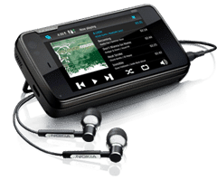
- Media Playback – the N900 can handle both video and music playback. Formats for video include: H.264, MPEG-4, Xvid up to WVGA (800×480 resolution with 25 fps), WMV up to VGA (30 fps) and, yup, FLASH VIDEO streaming in the browser. For music playback, the N900 supports MP3, AAC, AAC+, eAAC+, M4A, WAV and WMA. Pretty well rounded in my opinion.
- Screen – the screen is 3.5 inches (800×480) and is touch enabled with haptic feedback which means that when you interact with the screen, you get a vibration to confirm your actions. More about the screen a bit later.
- Dimensions – the N900 is a bit thicker than an iPhone or Droid (4.37 x 2.35 x 0.77 inches) and weighing 6.38 oz. In comparison, the Droid is 4.56 x 2.36 x 0.54 and iPhone 3GS is 4.5 x 2.4 x 0.48 inches. So, while the basic length and width are comparable, the N900 is thicker and heavier (N900 – 6.38 oz versus the Droid’s 5.96 oz and iPhone’s 4.8 oz).
The technical specification of the N900 are not too bad actually. However, it is how they are all packaged and the user experience that is critical. You could have the best made phone with the best parts but with an OS that cripples the experience.
Using the N900 and My Thoughts
Coming from using an iPhone regularly and having recently tested a DROID, I had certain expectations when I tested a “top of the line” smartphone. At $569.00 MSRP, I was expecting A LOT! It has to work well, have a clean experience and be intuitive. Normally when I test phones or other similar devices, I don’t read the user manual as I want to truly see how well things have been thought out.
The N900 is pretty much intuitive: click on icons and they launch, applications are grouped within a logical space on the device, and sliding the protective camera lens automatically launching the camera application are good examples, of this intuitive interface.
However, there are some design flaws or “un/under developed” features that I do think need to be addressed. Here are a few:
- Screen Rotation – So one of the first things that I tried to do when I was using the N900 was rotate the device and have the accelerometer kick in so that the screen went from horizontal orientation to vertical…uh…yeah. This didn’t happen. The only application that I have found thus far that supports a vertical orientation is the Phone application (I’m still searching and testing though). The N900 seems to be a device that wants to be horizontal and using the keyboard as a mini-computer. It’s not a huge deal, just something that I wasn’t used to and you have to know that from the start.
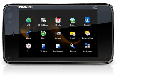
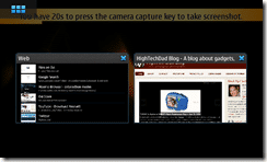
- Process/Application Button – there is a button in the upper left-hand corner of the screen (not a physical button) that confused me a bit. Clicking on it will either 1) open a icon list of running applications or 2) launch a screen listing applications you can launch. If you have applications running, you can back out to the application list screen pretty easily. I do like the ease of use of moving between (SIMULTANEOUSLY) running applications (uh…you can’t do that on an iPhone), I’m just not sure if I would have put a launch pad and an active applications list in the same button. Below is an example of a couple of running processes (and how you can select them):
- Scrolling through lists – I’m not sure if this is me or not, but I had an incredibly difficult time using my finger to scroll through lists. Either my finger is too big, the touch screen is too sensitive or I’m pressing too hard, because every time that I tried to scroll or “flick” through long lists of items, I always managed to launch an application accidentally or open a link on a webpage. To solve this issue, Nokia does provide a styles which stores in the body of the device. I found myself using the stylus more and more as I became more comfortable with the N900. I do recommend using the stylus.
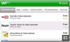
- Finding and Adding Applications – I have said it before and I will continue saying this, the provider that has the best application store experience will win or at least do better than their competitors. Apple clearly has a big head start in this race but Google and the Android Marketplace have done a nice job entering the race as well. When I first received the N900, the Nokia store was really non-existent. You could download a handful of apps but even those were barely a minimum. Luckily, during CES, Nokia announced that their store (the Ovi Store) as being available on AT&T. This is what the Ovi Store looks like on the N900:
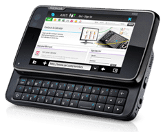
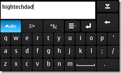
- Keyboard(s) – The physical keyboard is 3 rows and works ok. I didn’t find the keys to be raised enough for me and frequently my thumbs got lost trying to re-center. However, in comparison to the Droid’s keyboard, the N900’s is better, simply because it IS center and not offset by a Directional Pad although there are arrow buttons as well. There is also an on-screen keyboard which you can enable in the setting which I found helpful to have.
However, I don’t want this review to be entirely negative, there were a few things that should be highlighted that reflect some positives, specifically:
- Multitasking – the N900 is great at this, especially compared to other rivals out there. With 1 GB built in RAM, you can easily run multiple applications simultaneously.
- Browser – the browser is pretty impressive and has plenty of built-in tricks that you can use with it. For example, you can draw circles on a page and the page will either zoom in or out. If you drag the stylus from the side of the screen, it brings out an arrow that allows you to interact with the webpage. More hints on the types of gestures you can use are here. Also, it’s a fully compliant browser that supports FLASH! Below is a screenshot from the browser.
- Mail/Addresses/Calendars – the mail application handles every type of mail protocols including, POP, IMAP and, yes, even Exchange. I was able to sync my Exchange email, contacts and calendars without issue. There are even phone address book capabilities to integrate with Skype.
- Kickstand – it’s kind of odd, but I actually liked the kickstand (which you can find around the camera lens). I show how it works in the video below.
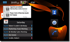
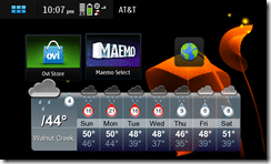
- Dashboard – the N900 has four customizable dashboards where you can add widgets and links to applications, show your calendars and other important information:
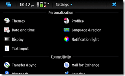
- Settings – the settings screen works well and it is actually nice to have everything in one place and easy to access:
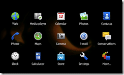
- Applications – the various applications are grouped in two pages, a primary application page and then a secondary page where any apps that you download and install show up:
Summing It Up
I have put together a quick video overview of the device. It was recorded prior to the recently-released software update that enables the online store browsing and downloading.
Another thing that I didn’t experience, but that some members of the press did at the launch of the n900 was the packaging and unboxing process that the press experienced. It is rather amazing if you ask me. Just the unboxing is available here and you can see the full video of that review here.
Any smartphone has a huge uphill battle versus the iPhone, Droid and Nexus One. While I think that the Nokia N900 is a good device with some solid engineering, I don’t think that the leaders of the smartphone pack have to worry that much about it though. Nokia, in my opinion, has a bit of a way to go with their App store and the OS itself to really be a strong contender. Perhaps they need to consider acquiring Palm to get that UI and OS experience and merge it into theirs?
Regardless, sometimes it is okay not to be the top player in the market. It allows you to do more innovative things and think a bit outside of the box without as much pressure to perform. Keep an eye on Nokia as I think they will do some dramatic things in the next year.
HTD says: While the Nokia N900 might not be the smartphone that I grab as a first choice, it definitely is a nice device that could grow well as the OS is updated and polished.


2 comments
murtiasih2020
Nice article, very detailed review. Thanks
buy r4i
don worry, u will be blessed if u get this phone, this phone will show u the right path