I have a little pet peeve about the way some car manufacturers lay out the steering wheel controls. While I remember the day when a steering wheel was just that, a round thing to turn the car. Now it seems that a huge amount of controls are now embedded throughout the steering wheel. You have cruise controls, audio controls, paddle shifters, phone controls, menu controls…you get it, lots of controls. The concept is to make important controls at hands reach, well, right where your hands should be. Honestly, it’s almost becoming overloaded with the controls. That’s fine, but I have one request to car designers and manufacturers. Put the volume controls on the left side of the steering wheel!
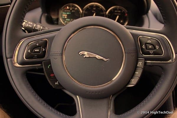
I have test driven a number of vehicles and I feel the steering wheel design is something that needs to be carefully considered by any buyer. Is it comfortable (I prefer wheels that are a bit thicker), does it have the core controls (cruise, media and phone controls), and can it be adjusted (up/down and forward/back)? Then you need to look at the layout to see if it is intuitively laid-out. And this is where my complaint about the positioning of the volume controls comes into play. But remember, this is my opinion…your mileage may differ.
Why Volume Controls Should Be on the Left
Here’s my reasoning. A good driver keeps both hands on the wheel. At least most of the time. Radio and audio equipment is usually in the center console, the area between the driver and the front seat passenger. And, the volume control for the audio equipment is typically located closer to the driver (or sometimes in the center). This way, both of the front-seat occupants can easily control it.
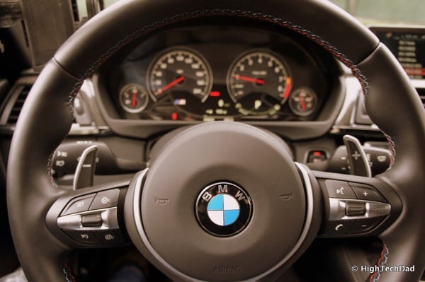
There is then, usually, a volume control on the steering wheel. This makes it more convenient and safer for the driver to control the audio equipment.
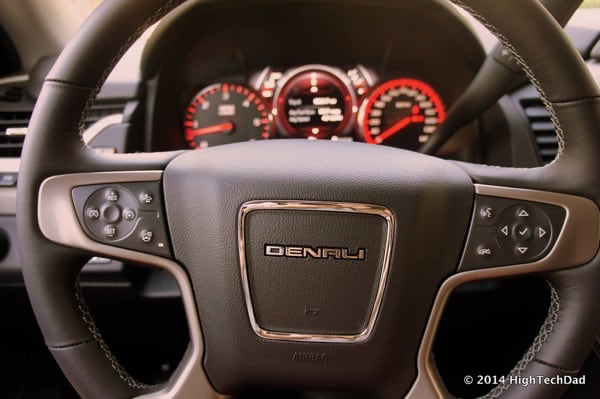
But, if the center console volume is accessible by the driver’s right hand, why is there a need to also have it on the right side of the steering wheel, ALSO controlled by the right hand?
The cup holders for the driver is usually located between the front seats towards the front. The driver usually uses their right hand to pick up drinks (unless you are a super-distracted contortionist). Many drivers drive holding a beverage (not the safest thing to do but it does happen, right). So, if you are holding a beverage, how do you change the volume, mute audio (or even answer a call)? Using your hand that is still on the steering wheel most likely – the left hand. THAT is where all of the “more used” controls should be placed.
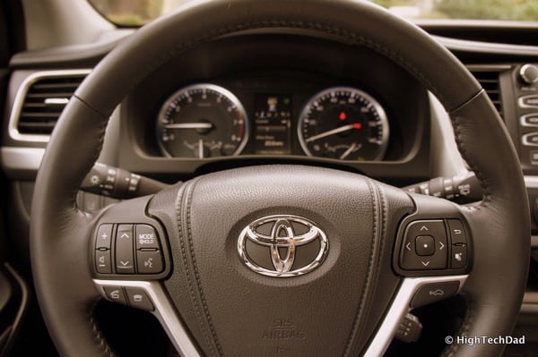
More often than not, volume, audio and telephone controls are used more frequently than things like cruise control.
So, I say put the less frequently used steering controls on the right and the more frequently used ones (like volume controls) on the left. It’s safer (you don’t have to put down your drink) and it’s more convenient.
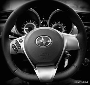
What is your preference? What makes the most sense to you? Leave a comment to weigh in!
HTD says: Just my little car design tip for the masses!


4 comments
Santiago Rueda
THANKS! I’m not kidding when I say that this blunder a deal breaker to me! I can’t even fathom the obvious sheer stupidity of placing the steering wheel’s volume control…. NEXT TO the middle console volume control. What are these so-called designers thinking? Great, great cars have gotten this wrong! INFURIATING… Grrr
Michael Sheehan
Haha – it was such an arbitrary design choice that I simply didn’t understand. I just HAD to write an article about it. Thanks for validating the article and glad that I’m not alone in thinking this way!
Darren
I prefer the left. I don’t know why the German cars like the right. Own a BMW and Lexus and prefer the Lexus on the left.
Slava
+100. Got here by googling “bmw steering wheel volume control on the left”. I want to buy a bimmer, but the steering wheel layout is driving me nuts. I’m used to answering my phone with the right hand (it’s usually in the center console) and turning the volume down with the left one, how do I pull it off in a BMW (well, bluetooth, but still, what the heck)? Totally stupid design decision.