Infographics seem to be one of the best ways to convey a message. More often than not, infographics compile industry statistics and tend to tell a compelling story. Some infographics can be complex while others are simply fun to read. One of the reasons for their success is due to their visual nature. As a result of high-resolution smartphones, better computers and easy publication options, we have become a society driven by visuals, whether they be images or video. Facebook has given graphics much more real estate within the news stream. And applications like Instagram, Pinterest and Vine have further bolstered visual content and design, as have established companies like Google (YouTube and Google+), Microsoft (think how visual Bing.com is) and Apple (who has always looked towards clean visual aesthetics in their marketing and design).
And no discussion about infographics is complete without showing this famous graphic by Charles Joseph Minard in 1869 depicting the French invasion of Russia in 1812.
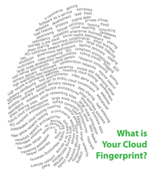
While I’m not a visual graphic designer, I do visualize things mentally and articulate these visions either through words or simplistic graphics. There are many ways to visually communicate an idea. At my work at GoGrid as the Technology Evangelist there, I often talked about the visual of the Cloud Pyramid which I conceived quite a few years ago. Similarly, another “infographic” that I produced during my tenure at GoGrid was that of the Cloud Fingerprint, the premise being that every business is unique and consequently the cloud infrastructure that you use should reflect and embrace that uniqueness.
While I wouldn’t exactly call the Cloud Fingerprint an infographic, it did communicate the idea of being unique and distinct, while incorporating various business types as the ridges and valleys of the actual fingerprint. The commoditization of cloud computing makes it difficult to truly find a solution that fits your needs at times – think about the square peg and the round hole scenario – so it was important for me to convey uniqueness in the graphic
Visually Presenting a Business without Confusion
Similarly, when you run a business, you need to think about how to visually represent your business. A cluttered or confusing visual presence, whether it is in your advertising or in your corporate website, conveys that same confusion to the end-user or customer. If your internal decision-making process is disorganized or if you haven’t streamlined your business processes for efficiency, this disorder can manifest itself externally through mixed marketing or product messages or from a disrupting sales process.
The written word can be quickly and easily corrected or manipulated, assuming you have clear direction, continuity and consistency of your messaging. But when it comes to a graphic representation, people tend to remember the visual story a bit better than the written word so it is critical to get your visual design right. My recommendations:
- Choose your messaging carefully
- Express your messaging clearly through written AND graphical means
- Ensure that all members of your team buy into the messaging, fully understand it and can articulate it
- Get a creative team that can visualize what you are trying to convey
- Follow the K.I.S.S. method (Keep It Simple Stupid) – a common term
- Avoid the 4 C’s (Complexity Can Create Confusion) – my own creation
By focusing on a clean and simple message (which takes the longest time actually), the subsequent work is a bit easier. If you are trying to say or convey too much, your customers will get lost. For example, if you have many CTAs (Calls to Action – like a “chat now” or “signup now”) on a landing page, your audience may not know how to proceed. To make a point, take a look at these landing pages compiled by KISSmetric: “5 Truly Awful Landing Pages You Won’t Believe are from Well-Known Companies” – from clutter to too many CTAs to product and discount discontinuity to educating with information overload – these pages run the gamut.
Small to Mid-Sized Businesses Are No Different
Whether you are a large corporation or a small business, you need to ensure that your messaging is clear. And it can also be large corporations helping small businesses. IBM for Midsize Business is running a nifty campaign that uses humorous graphics to help provide tips to running a small business. They have broken down the graphics into categories:
- How Not to Use Company Data
- How Not to Save Money Around the Office
- How Not to Gain Customer Insights
- How Not to Improve Employee Productivity
- How Not to Collaborate in the Workplace
- How Not to Make Critical Business Decisions
You can see all of the tips graphically represented here. But here are some of my favorites – again, simple ideas, humorously drawn, conveying important business practices (or the opposite).
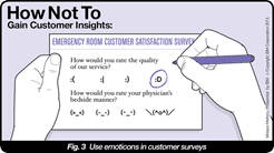
Customer Insights: Use Emoticons in Customer Surveys
While keeping pulse of your customers’ feelings is critical, there are good and bad ways of doing this. Falling under the K.I.S.S. rule, this is either too “simple” or just too abstract for your customer.
Company Data: Turn Old Hard Copies into Gift Wrap
Do you remember the time when you could search Google for “Confidential & Proprietary” and append an Office document suffix or “.PDF” to the search and see a lot of confidential data? You still can! So be sure to treat all of your company data with confidentiality. You never know where it might pop up.
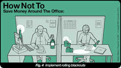
Save Money: Implement Rolling Blackouts
There are good ways and bad ways to save money around the office. Obviously, using the cloud is a good way and working by the light of candles is a bad one.
Employee Productivity: Change Office Hours from 9-5 to 5-9
While changing office hours may be a bit dramatic, you should always remember that we have a global economy now and adapting your business process to match the needs of your customers is critical. If that means extending your hours or having swing or late night shifts, you may need to consider that.
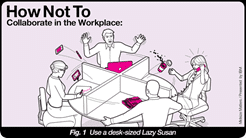
Collaborate: Desk-sized Lazy Susan
Funny as this may seem, having cross-functional teams or individual contributors can make your small business even more successful. In a small business, there are typically individuals who wear many hats, so this concept should not seem foreign in any way.
Critical Decisions: Rock-paper-scissors
Actually, any decision-making process is part educated, part guess work, part luck and part gut feel.
While these graphics are a bit tongue-in-cheek, they do provide some good ideas for any business, large or small. But the point being, a simple and clear message that is cleanly depicted through a graphic can inspire as well as give you ideas. It all circles back to the points I made earlier. Remember to keep your ideas away from the complexity vortex as it can suck your creativity and confuse your audience in the process.

HTD says: A picture is worth a thousand words, but if it is too complex, you might as well be shouting into an empty room.
